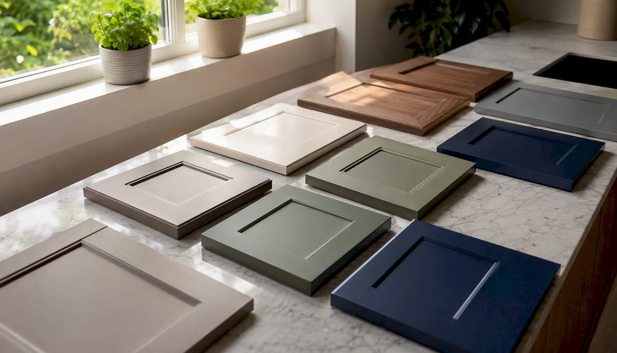
The dominant story in kitchen cabinet color trends for 2026 is a clear shift toward earthy "new neutrals" and moody accents that feel personal and grounded rather than stark or clinical. Design experts describe this direction as "warmth without nostalgia" — colors that age well, photograph beautifully, and hold their appeal long past the next trend cycle. Your single best next step: order large paint samples and test them on actual panels in your kitchen at morning, midday, and evening light before committing to any color.
The five color families leading the 2026 palette:
- Warm neutrals and greige — the most specified base color, anchoring the majority of 2026 kitchen projects
- Muted greens and sage — the fastest-rising accent and full-kitchen color among designers
- Deep navy and indigo — a steady favorite for islands and lower cabinets
- Rich burgundy, plum, and terracotta — emerging moody accents for bold island statements
- Natural wood tones — white oak and walnut stains returning as a "new neutral" alternative to paint
Industry survey data and designer reporting from the National Kitchen and Bath Association (NKBA) confirm warm neutrals, greens, and blues as the three dominant cabinet color families heading into 2026. Best Cabinet Specialist carries finish options across these families in both ready-to-assemble and assembled configurations, so you can match the look without a custom lead time.
Key Takeaways
The most important thing to know about 2026 cabinet colors: warm neutrals anchor the palette, muted greens and navy lead the accent choices, and testing large samples in your actual kitchen is the single step that prevents the most expensive mistakes.
| Point | Details |
|---|---|
| Dominant 2026 palette | Warm neutrals and greige anchor most kitchens; muted greens and navy are the fastest-rising accent families. |
| Test before you order | Paint a full panel and view it at morning, midday, and evening light before locking any color code. |
| Two-tone strategy | Lighter uppers plus a moody island or lower run adds personality while protecting resale value. |
| Finish and sheen matter | Satin is the most practical sheen for most cabinets; semi-gloss cleans easiest in high-traffic kitchens. |
| Best Cabinet Specialist | Offers RTA and assembled cabinets in on-trend finishes with fast shipping — order samples to confirm color before full purchase. |
Table of Contents
- Top kitchen cabinet color trends for 2026
- How two-tone cabinets and accent runs let you add color safely
- Why stained wood and natural finishes are back in 2026
- How finish and sheen affect color appearance and cabinet maintenance
- How to pick and test cabinet colors in your actual kitchen
- U.S. paint brands and specific shades worth sampling
- Ordering, lead times, and durability: painted vs stained, RTA vs custom
- How cabinet color affects mood and how you feel in the kitchen
- Regional preferences shaping cabinet color choices in 2026
- Why the 2026 palette is the right call for most homeowners
- Get on-trend cabinets shipped fast with Best Cabinet Specialist
- Sources
Top kitchen cabinet color trends for 2026
Designer rankings and industry surveys show warm neutrals anchoring the 2026 palette at the broadest level, with muted greens and deep blues rising fastest as accent and full-kitchen choices. Cool blue-gray from the 2010s is clearly fading; warm undertones now define what reads as current.
1. Warm neutrals and greige
Greige (gray-beige) and warm off-whites are the workhorses of 2026 kitchens. They read as clean without the clinical chill of pure white, and they pair with virtually every countertop material and hardware finish. Benjamin Moore Revere Pewter and Sherwin-Williams Accessible Beige are two frequently cited starting points. Pair with quartz in warm white or cream, brushed brass or matte black hardware, and a simple subway or zellige backsplash. Best for full kitchen runs, especially in homes with resale timelines under five years.
2. Muted greens and sage
Sage, olive, and dusty green are the single most-discussed trending cabinet shades for 2026. Sherwin-Williams Evergreen Fog is the most-referenced designer pick; it reads sage in daylight and deepens to a richer olive under evening lighting, making it one of the most versatile cabinet colors available. Pair with unlacquered brass hardware, white oak shelving, and a white or cream countertop. Works well as a full kitchen color in north-facing rooms and as an island accent in brighter spaces.
3. Deep navy and indigo
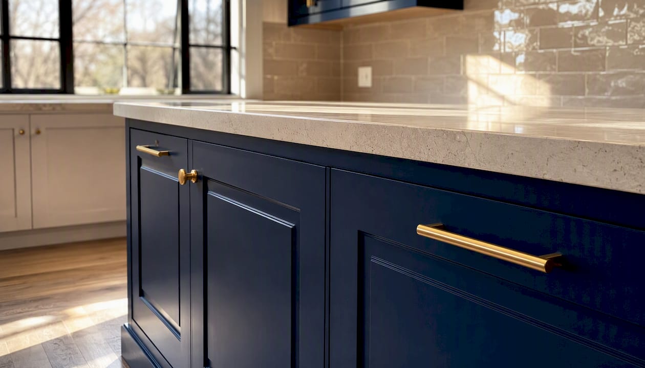
Navy has held its position as a top cabinet color for several years, and 2026 is no exception. Benjamin Moore Hale Navy and Sherwin-Williams Naval remain the most-specified shades. Navy reads differently in north-facing kitchens (cooler, more dramatic) versus south-facing ones (richer, warmer), so testing is non-negotiable. Pair with white marble or light quartz countertops, polished nickel or chrome hardware, and a white subway tile backsplash for a classic result. Best reserved for islands or lower cabinets in smaller kitchens; works as a full-kitchen color in larger, well-lit spaces.
4. Rich burgundy, plum, and terracotta
These deeper, warmer tones are the boldest entries in the 2026 shortlist. Farrow & Ball Preference Red and Benjamin Moore Moroccan Spice are designer-referenced starting points for terracotta and burgundy directions. These shades work best as island statements or accent lower runs rather than full kitchen applications. Pair with natural stone countertops, aged brass hardware, and a neutral backsplash to let the cabinet color carry the room.
5. Natural wood stains and white oak
White oak surpassed painted finishes as the fastest-growing cabinet choice among design professionals, and it functions as a true "new neutral" in 2026 kitchens. A light-to-medium white oak stain pairs with almost any countertop material and reads warm without committing to a paint color. Walnut tones add depth and work particularly well in modern and transitional kitchens. Covered in more detail in the stained wood section below.
6. True black and charcoal
Black cabinets remain a strong choice for high-contrast, modern kitchens. Sherwin-Williams Tricorn Black and Benjamin Moore Onyx are the most-specified shades. Black reads as sophisticated in large, well-lit kitchens and as heavy in small or low-light spaces. Pair with white or light gray countertops and stainless or chrome hardware. Best for islands, lower cabinets, or full kitchens with significant natural light.
7. Soft creams and warmer whites
Pure white is losing ground to warmer, creamier alternatives. Benjamin Moore White Dove is the most-cited designer pick for a warm white that avoids the yellow cast of traditional cream. Designers and color directors consistently recommend it as a safe, timeless choice that photographs well and pairs with almost any material. Pair with warm wood accents, stone countertops, and brushed gold or matte black hardware.
8. Butter and ochre
Soft butter yellows and muted ochres are emerging as a quieter trend for 2026, particularly in cottage, farmhouse, and Mediterranean-influenced kitchens. Farrow & Ball Hay is a frequently cited reference. These shades work best in kitchens with strong natural light; in north-facing rooms they can read muddy. Pair with natural wood, white countertops, and simple hardware.
The table below reflects designer preference signals from industry survey reporting:
| Color family | Designer preference signal | Best placement |
|---|---|---|
| Warm neutrals/greige | Highest overall specification rate | Full kitchen, all sizes |
| Muted greens/sage | Fastest-rising color family | Full kitchen or island |
| Deep navy/indigo | Steady top-three choice | Island, lowers, full kitchen |
| Natural wood/white oak | Fastest-growing non-paint finish | Full kitchen, island |
| Rich burgundy/terracotta | Emerging accent trend | Island, accent lowers |
How two-tone cabinets and accent runs let you add color safely
Two-tone kitchens have moved from trend to near-default in 2026 project planning. Designers consistently recommend darker below and lighter above as the lowest-risk formula because it keeps the upper visual field open while grounding the lower half with personality.
The three most-requested formulas:
- Warm white uppers + navy lowers — the most classic two-tone combination; works in kitchens of any size
- White uppers + sage or olive island — introduces green without committing the full kitchen to it; ideal for open-plan spaces
- Wood-tone uppers + painted lowers — pairs the warmth of white oak with a grounded painted base; popular in transitional and modern kitchens
Professionals recommend limiting moodier colors to islands and lower runs so the kitchen stays bright and resale-friendly.
Dos and don'ts for two-tone kitchens:
- Do keep large vertical sightlines (upper cabinets, walls above the counter) light to avoid a closed-in feel
- Do use the island as your boldest color statement — it reads as intentional and is the least expensive element to repaint later
- Don't match the lower cabinet color to a dark floor; the room will feel heavy
- Don't use two warm colors of similar value (e.g., greige lowers and warm wood uppers) without a clear contrast between them
- Do balance bold lower or island colors with neutral countertops and simple backsplashes
In small kitchens, stick to one accent color on the island only and keep everything else light. In large or open-plan kitchens, you have more flexibility to run a moody color across all lowers or even the full perimeter.
Why stained wood and natural finishes are back in 2026
White oak and walnut stains are not a nostalgic throwback. They are filling the gap left by the retreat of cool gray, offering warmth and visual texture that no paint color fully replicates. Industry reporting confirms wood grain surpassed painted cabinets as the fastest-growing finish choice among design professionals, with white oak the single most popular species.
Wood-tone cabinets work especially well when:
- The kitchen has warm-toned flooring (white oak cabinets and white oak floors create a cohesive, layered look)
- You want to pair with brass or black hardware without committing to a paint color
- The space benefits from visual texture rather than a flat painted surface
Practical pairing suggestions:
- Painted lowers in navy or sage + white oak uppers — one of the most-requested combinations in 2026 designer projects
- Natural wood island + painted perimeter cabinets in warm white or greige
- Match the undertone of your wood stain to your flooring; a red-toned walnut against a cool gray floor creates an undertone clash that reads as unfinished
When to choose stain over paint: if your cabinet doors have visible grain and you want to preserve it, stain is the right call. Paint hides grain entirely. For modern kitchen ideas that blend both approaches, a mixed finish strategy often delivers the most visually interesting result.
How finish and sheen affect color appearance and cabinet maintenance
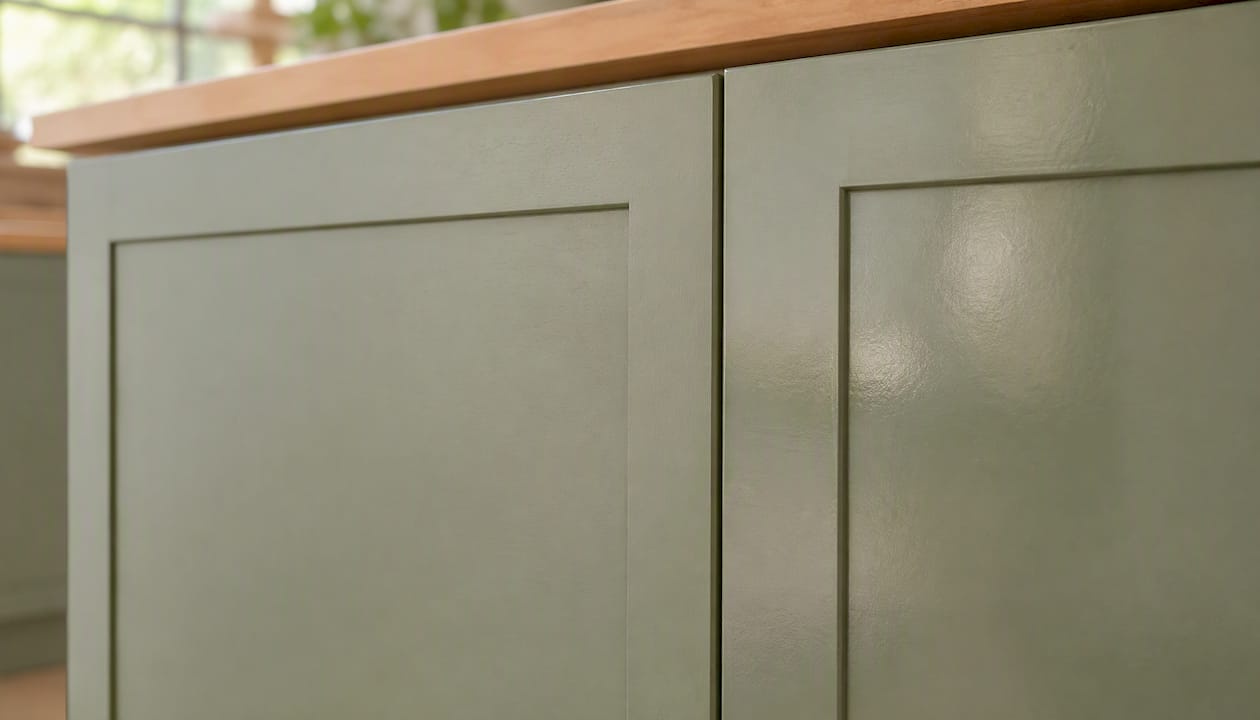
Sheen changes how a color reads more than most homeowners expect. A matte sage green and a semi-gloss sage green in the same paint formula will look like two different colors in the same light.
| Finish/sheen | Appearance | Best use | Maintenance |
|---|---|---|---|
| Matte | Flat, absorbs light, deepens color | Accent cabinets, low-traffic areas | Harder to wipe clean; shows scuffs |
| Eggshell | Slight sheen, softens color | Bedroom-adjacent kitchens, low traffic | Easier than matte; not ideal for heavy use |
| Satin | Soft glow, true color representation | Most cabinet applications | Cleans well; hides minor imperfections |
| Semi-gloss | Reflective, brightens and lightens color | High-traffic kitchens, island bases | Easiest to clean; shows surface flaws |
Satin is the most widely recommended sheen for painted cabinets because it balances cleanability with a finish that doesn't amplify every surface imperfection. In north-facing kitchens with limited natural light, a satin or semi-gloss finish will reflect more light and keep the color from reading too dark. In south-facing kitchens with strong daylight, matte or eggshell can work on accent cabinets without looking flat.
How to pick and test cabinet colors in your actual kitchen
Testing is where most remodeling mistakes happen. A color that looks perfect on a chip at the paint store will often read completely differently once it's on a cabinet door in your kitchen. Follow these steps before ordering.
- Audit your lighting. Note which direction your kitchen faces (north-facing rooms get cooler, indirect light; south-facing rooms get warm, direct light). Identify your bulb type — warm white LEDs (2700–3000K) will push warm undertones; cool white LEDs (4000K+) will pull out cool undertones.
- Order large samples. A 2-inch chip is not enough. Designers and color directors insist on painting a full door or a large panel — at minimum 12 by 16 inches — before committing.
- View at multiple times of day. Morning light, midday, and evening artificial light will each show a different version of the same color. Evergreen Fog, for example, reads sage at noon and considerably deeper at 9 PM under warm LEDs.
- Place the panel next to your actual countertop and backsplash. Undertone clashes between cabinet color and countertop are the most common source of post-installation regret.
- Photograph it. Colors read differently on camera than in person. If you're sharing the decision with a partner or designer, photos help align expectations.
- Evaluate against your resale timeline. If you plan to sell within three years, test your shortlist against warm white and greige as well — those are the safest resale choices.
Timing note: for painted cabinets, lock your paint code at least two weeks before your cabinet order date so the factory can match it. Stained cabinets require a sample door approval step that can add one to two weeks to the production timeline.
Pro Tip: Mount your test panel on an actual cabinet door or drawer front at eye level, not flat on a countertop. The angle at which light hits a vertical surface is completely different from a horizontal one, and the color will read differently.
U.S. paint brands and specific shades worth sampling
These are the shades designers reference most often for 2026 cabinet projects. Every one of them should be sampled in your kitchen before ordering — the same named color reads differently under different lighting conditions, and what works in a designer's portfolio photo may not work in your north-facing kitchen.
Sherwin-Williams:
- Evergreen Fog (SW 9130) — the most-cited muted green for 2026 cabinets; versatile across light conditions
- Naval (SW 6244) — a deep, warm navy; consistently recommended for islands and lower cabinets
- Accessible Beige (SW 7036) — a reliable warm neutral for full kitchen runs
Benjamin Moore:
- White Dove (OC-17) — the go-to warm white; cleaner than cream, warmer than pure white
- Hale Navy (HC-154) — a slightly softer navy than Naval; works well in transitional kitchens
- Revere Pewter (HC-172) — a warm greige that pairs with almost any countertop material
Farrow & Ball:
- Mizzle (No. 266) — a muted, earthy green with gray undertones; reads sophisticated in larger kitchens
- Preference Red (No. 297) — a terracotta-adjacent burgundy for bold island statements
- Pigeon (No. 25) — a soft blue-gray that reads warmer than most cool grays
Paint formula guidance: Cabinet-grade enamels outperform standard wall paint in durability. Benjamin Moore Advance (a waterborne alkyd) is the most recommended DIY-friendly option. Sherwin-Williams Emerald Urethane Trim Enamel is the pro-level choice for maximum hardness and cleanability. Always sample within the brand you plan to buy — the same color name from a different manufacturer will not match.
Ordering, lead times, and durability: painted vs stained, RTA vs custom
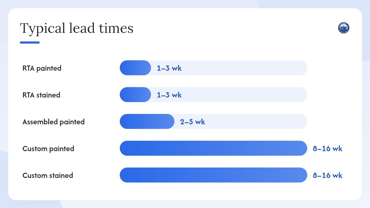
Finish choice affects not just appearance but your project timeline and budget. Exploring RTA options is often the fastest path to an on-trend finish without a custom lead time.
| Cabinet type | Typical lead time | Durability notes | Cost profile |
|---|---|---|---|
| RTA painted | 1–3 weeks | Factory-applied finish is consistent; touch-up paint needed for chips | Most affordable |
| RTA stained/wood tone | 1–3 weeks | Stain penetrates wood; minor scratches less visible than on painted surfaces | Affordable to mid-range |
| Assembled painted | 2–5 weeks | Same finish quality as RTA; arrives ready to install | Mid-range |
| Custom painted | 8–16 weeks | Highest finish quality; color-matched to exact specification | Premium |
| Custom stained | 8–16 weeks | Species and stain depth fully specified; longest lead time | Premium |
RTA and assembled cabinets from a quality supplier use plywood box construction and solid wood doors, which hold paint and stain finishes better than particleboard alternatives. The durability gap between RTA and custom narrows significantly when the box material is plywood.
Pro Tip: Lock your paint code in writing with the supplier before production begins. Request a pre-finished door sample for approval before the full order ships — this one step prevents the most common finish-mismatch complaints.
For project coordination, order cabinet samples at least six to eight weeks before your target installation date. Counter-top fabrication typically runs three to five weeks after template, so your cabinet delivery and countertop template need to align. Reviewing budget-focused cabinet options early in the planning process helps you allocate finish budget before countertop quotes arrive.
How cabinet color affects mood and how you feel in the kitchen
Color psychology is not abstract in a kitchen. You spend real time in this room, and the color on your cabinets shapes how that time feels.
Warm neutrals and greige create a calm, welcoming atmosphere that most people find easy to live with long-term. They don't demand attention, which is exactly why they dominate resale-ready kitchens. Muted greens connect to a sense of calm and natural order — research in environmental psychology consistently links green tones to reduced stress and a sense of groundedness, which explains why sage and olive have moved from accent walls to full cabinet runs.
Deep navy and charcoal create a sense of enclosure and focus. In a kitchen used primarily for serious cooking, that feeling can be a feature. In a kitchen that doubles as a social hub, it can feel heavy unless balanced with significant natural light and light countertops.
Rich burgundy and terracotta bring warmth and energy — they stimulate appetite and conversation, which is why they work well on islands where people gather. Butter and ochre tones have a similar effect at lower intensity.
The practical takeaway: match your color choice to how you actually use the kitchen, not just how it looks in a photo. A moody navy island looks stunning in a magazine spread; it also looks stunning in a well-lit, open-plan kitchen where you host regularly. In a small, closed kitchen used mostly for quick weeknight meals, that same navy can feel oppressive by Tuesday.
Regional preferences shaping cabinet color choices in 2026
Cabinet color preferences in the U.S. vary more by region than most national trend reports acknowledge.
In the Northeast and Pacific Northwest, cooler, more muted palettes tend to dominate. Sage greens, soft blues, and warm whites align with the architectural character of older homes and the preference for understated, quality-focused design. Farrow & Ball shades see higher specification rates in these markets than anywhere else in the country.
The South and Southwest lean warmer. Terracotta, ochre, and warm wood tones connect to regional architecture and the strong natural light that makes these shades sing rather than muddy. White oak performs particularly well in Texas and Arizona markets, where open-plan layouts and abundant sunlight suit its warm, natural character.
Midwest kitchens tend toward practical durability with a preference for warm neutrals and greige. Navy and sage are growing in urban Midwest markets (Chicago, Minneapolis) but remain accent choices rather than full-kitchen colors in most suburban projects.
Coastal markets (Southern California, Florida, the Carolinas) favor lighter, airier palettes. Soft creams, warm whites, and light wood tones dominate, with navy reserved for beach-house islands. Bold moody colors are less common in these markets because the design goal is often to maximize the sense of light and openness.
These regional patterns matter when you're making a resale-conscious color choice. A deep burgundy island may be a standout feature in a Brooklyn brownstone renovation and a harder sell in a suburban Phoenix listing.
Why the 2026 palette is the right call for most homeowners
The shift toward earthy new neutrals and strategic moody accents is not a passing fashion. It reflects a genuine correction after a decade of kitchens that prioritized photography over livability. All-white kitchens look clean in listing photos and feel sterile to cook in every day. Cool gray cabinets photographed well in 2015 and now read as dated.
The 2026 palette gets the balance right. Warm neutrals and greige give you a kitchen that feels comfortable, ages well, and appeals to the broadest buyer pool. Muted greens and navy, used on islands or lower runs, give the space personality without locking you into a color that will feel exhausting in three years.
My honest recommendation: if you're remodeling with a sale in mind within five years, use warm white or greige for your main cabinet run and save the color for the island. If you're staying put for a decade or more, commit to the sage or the navy on the full perimeter. You'll be glad you did. The homeowners who regret bold cabinet colors are almost always the ones who went bold on a small kitchen with limited light — not the ones who committed to a well-chosen moody shade in a space that could carry it.
Get on-trend cabinets shipped fast with Best Cabinet Specialist
Knowing which colors are trending is only half the work. Getting them installed on time is the other half, and that's where lead time matters.
Best Cabinet Specialist offers ready-to-assemble and assembled cabinets with plywood box construction and solid wood doors in finishes that align with the 2026 palette — warm whites, wood tones, and painted options that ship significantly faster than custom lead times. You can browse finish options and order samples to confirm your color before the full order ships, which is exactly the testing step every designer recommends. Order your samples at least six to eight weeks before your target installation date to leave room for countertop coordination. Visit Cabinet-specialist to check current finish availability and get your project started.
Sources
The following sources informed the trend data, shade recommendations, and practical guidance in this article. Each is worth reading if you want to go deeper on a specific color family or testing method.
- Kitchen Cabinet Color Trends 2026 — Designer Rankings – Easy Room AI
- Most Popular Kitchen Cabinet Colors 2026: Top 15 | FacadeColorizer
- 6 Kitchen Cabinet Colors Design Pros Say Will Be Huge in 2026 | Good Housekeeping
- Designers reveal the kitchen color set to define 2026 | Homes & Gardens
- Move Over, White: The Biggest Kitchen Cabinet Color Trends for 2026 | Brit + Co